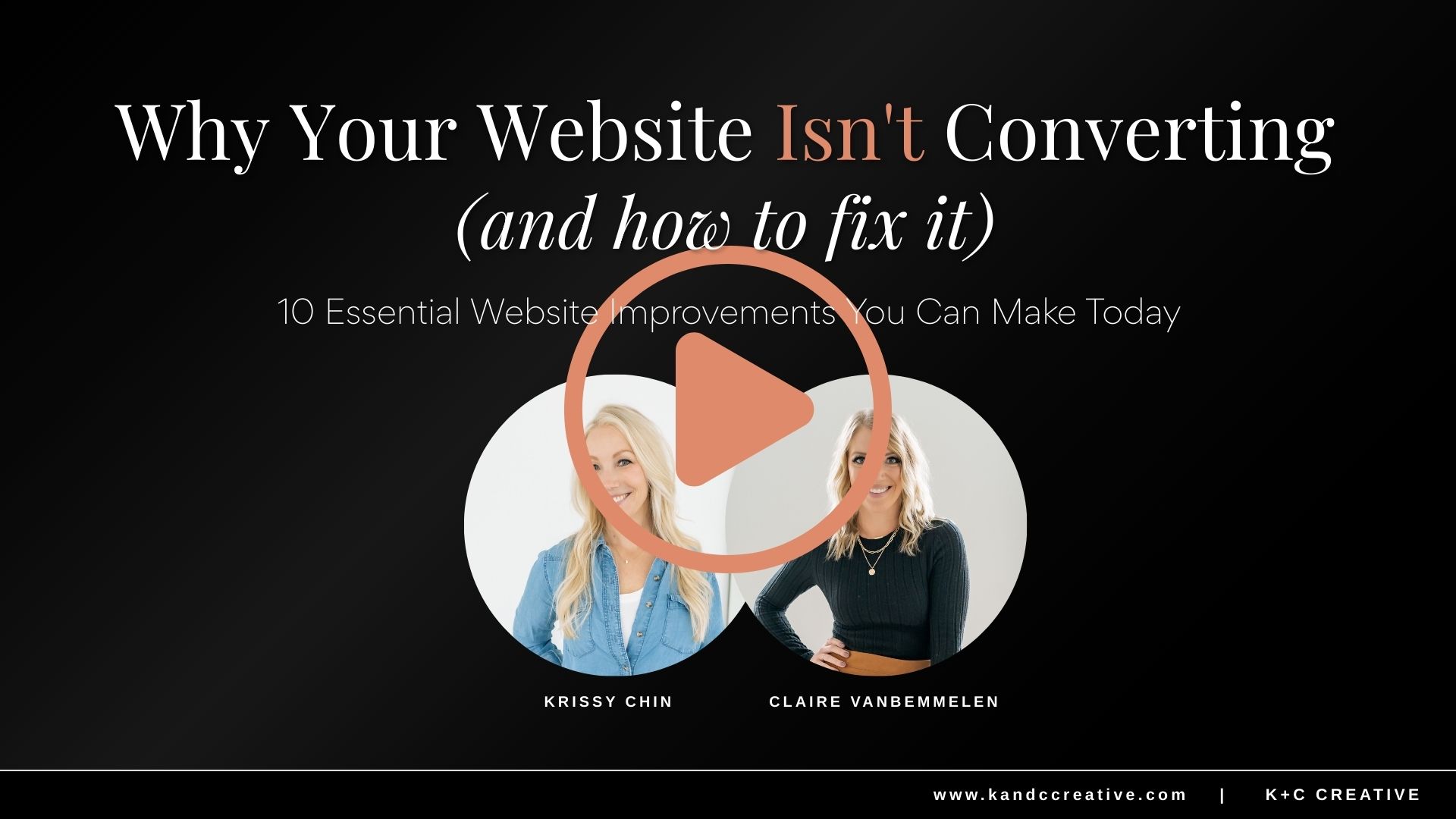
Attract Customers that Convert: The Best Website Design Tips For Small Businesses
Aug 14, 2024Have you ever visited a website that was so hard to navigate or comprehend that you immediately left the site? Or maybe it was so busy and chaotic that you felt overwhelmed without even trying to read the page or navigate to what you were looking for? Website design is CRUCIAL to keep your visitors on your site, finding what they want or need, and keep coming back for more!
Don't start building your website without learning and implementing the best website design tips for your small business!
Website Design Tip #1: Consistent Branding is Crucial
When it come to best website design practices, consistency is key. It is important to maintain a consistent color scheme, typography, and imagery to reinforce your brand identity across the entire website. Before diving into building your website, we recommend establishing your brand guidelines so that you have a resource to go back to time and time again or a guide you can hand off if you choose to hire out your design work that sets the standard for your branding. We have even developed a free resource for you to make this even easier! Access the FREE brand guide and website mockup resource here.
Okay, now let's dive into the consistency categories.
Typefont Tips For Your Website:
It is ideal to pick 3 different fonts (max), for variety. Always err on the side of simplicity. You don't want TOO much chaos on your website. The three different fonts are categorized as HEADER, ACCENT, and BODY font.
- HEADER FONT should be clean, legible, and look good in both lowercase and uppercase.
- ACCENT FONT has a little more flexibility, more playful, elegant, bold, etc.
- BODY FONT should be easy to read and will be used in a majority of your copy.
Here are some examples of header, accent, and body font combinations:

Once you find your ideal header, accent, and body font, play around with it to see if it works for various applications. Type out sentences with your accent font to see if it is hard to read. Use your header, accent, and body font on some simple marketing materials (flyers, business cards, lead magnet) to see if it translates.
If you can’t find what font styles you are looking for in Canva, Google Fonts, or your respective website platform when choosing your font, you can explore options at:
BONUS TIP:
If you are looking for something more sophisticated and “classic” I recommend a SARIF font (which has those little feet on it) SAN SARIF will make your brand feel more modern, Script font will make your brand feel more feminine or elegant, and Bold font can make your brand feel more masculine or assertive.
Keep Your Branding Colors Simple On Your Website:
If you aren’t sure what colors work well together, stick with ALL neutral/light colors and choose ONE color that “pops” that you use for an accent color. Adding images and photography that have color in them will bring color to your website so keep this in mind when choosing your imagery and photography.

Website Design Tip #2: Imagery/Photography For Your Website
Consider choosing images and photography that complement your accent color and don’t contrast. If your brand is muted and neutral, choose stock photos that reflect that and think about that when you plan your personal branding photoshoot. If your brand is bold and bright, consider stock photos with color that matches your brand. You can see in the example below, the photography and stock photos that were chosen in the color inspiration on the left are strategically incorporated into the website design mockup to balance the colors out throughout the site as you scroll.

Website Design Tip #3: Whitespace or Negative Space
How much whitespace should you have on your website? Whitespace, or negative space, is crucial in web design because it:
- enhances readability
- focuses attention on key elements
- creates a visually pleasing layout that doesn't confuse or stress out the reader
Negative space on a website page helps prevent information overload and improves the overall user experience by making the content more digestible and engaging. When you are building out your webpage, allow for ample whitespace to prevent visual clutter, improve readability, and create a more aesthetically pleasing design. The snapshot of the website page example below shows ample space around the header fonts and imagery that forces you to read and engage in one topic at a time while you are scrolling.

Website Design Tip #4: Dynamic Visuals Will Make Your Website Pop
Adding a "fixed background" to your background section imagery and animation to your text and visuals on your website can help draw your audience to a specific section to stop and read. It also helps the reader's eye find things to focus on based on what you WANT them to read.
For example, if you have an image that slides in from the left toward your header and subhead at the top of your page, it draws the eye toward the text so that the reader goes to that first and reads exactly why they are on your page and what you plan on providing before they scroll or click anywhere else. Adding animation to your website design is also great for buttons on your page. Imagine you are scrolling on a page and reading about a service offering and as you scroll a button floats in from the right with a call to action that says "book a call to get a custom quote". That animation forces your eye to read that button and can level up the conversion on your website.
Adding animation takes your site from boring and drab to interactive and dynamic without clutter and chaos.
PRO TIP:
Less is also more with dynamic visuals on your site. If you choose to animate an image along side a section of text, keep your text stationary and visa versa.
Same goes for the style of animation. Depending on your website platform, you will have a variety of different animation options. Space out what you use and change it up but pick 2-3 (max) styles and stick with those.
Website Design Tip #5: Don't Forget About the Importance of Your Visual Imagery
When a visitor is browsing your website, they experience visuals first, then section headers, then the copy within that section. It is important to use high-quality, relevant images to capture attention and enhance the visual appeal of each section of your website. Say for instance you have a program that will help your customer save time and build their business while enjoying life to the fullest. A photo of your target demographic enjoying life together with friends (not work) would show the ideal results of your program therefore helping this visitor see themselves with these results.

Or maybe you have a free training that teaches people how to grow their email list like Amy Proterfield. An image of someone seeing analytics on their phone would be the perfect visual to show what this free training could do for your business.

Visuals matter and they help your website visitor better understand what it is they are about to read. It is important to be intentional and informative when choosing photography and graphics for each section of your website design.
Website Design Tip #6: Make Sure Your Site Has Clear Navigation
Design an intuitive and easy-to-navigate menu structure to help users find information efficiently. Website navigation is an important factor in user experience as well as search engine optimization (SEO). When thinking about navigation, make sure your website is both user-friendly and effective. Keep in mind these three components:
- Keep it simple - Navigation helps users find what they need quickly. To prevent overwhelming your visitors, limit your primary navigation menu to seven items. Dropdown menus can help compartmentalize your navigation labels. When using dropdown menus, make sure they they make sense or your visitor will not be able to find certain pages. For instance, you wouldn't put "services" under "contact". Instead it would be smart to have a "work with me" tab or a "services" tab and the drop down would list HOW they can work with you in the form of separate links that go to individual pages.

- Make it visible - Make sure your navigation is easy to find and read. Place the main menu at the top of the page where users expect to find it. Use visual contrast like background colors to make the navigation stand out against the top section of the website pages. If it make sense, add call-to-action buttons to call out something you want your visitor to do or experience the most like a Free Opt-in or a "Book a Call" button.

- Use descriptive labels - Label buttons or links clearly to show exactly what each page is about. This is helpful for both visitors and for showing up in search results. This is important for both the menu bar at the top of your page AND the navigation buttons throughout your site.
Website Design Tip #7: Don't Forget About Responsive Design (Make it Mobile Friendly)
According to an article on SEMrush, in 2023 mobile devices receive 30 billion more website visits and unique website visitors than desktop. More and more people are interacting with websites through their phone. It is extremely important to ensure your website adapts seamlessly to various devices and screen sizes for a user-friendly experience, especially mobile.
Make sure that all images, text, buttons, and navigation are easily accessible across all platforms and function properly.

Final Note: Consistently Do a Website Audit
As you add to your website and continue to develop your business and your brand, it is important to go through your website to assure that everything is consistently designed, your navigation is clean and clear throughout every page of your site, your dynamic visuals aren't glitching on different devices, your images are consistent across desktop, tablet, and mobile, and your overall site is user-friendly and seamless.
Ask your friends to test your site for issues or inconsistencies. Browse the front end of your site with a "consumer eye" to see if anything feels off, inconsistent, or confusing.
Now, how can you avoid these mistakes and create a beautiful website?
We've got you covered with a freebie! We've developed a Canva template and training to help you kickstart your website journey. With this template, you can experiment with colors, fonts, and imagery until you find the perfect fit for your brand that will translate onto a well-curated website. Plus, we'll show you how to create a brand guide to keep everything consistent.
So, if you're ready to take your brand to the next level, grab your freebie today. And don't forget to follow Claire on Instagram @ClaireMarieDesign for even more design tips and inspiration.

Get the Perfect Freebie Idea in Seconds!
If you're tired of wondering what you should offer and if it will even convert to sales, then you need our 'AI Freebie Idea Generator' to help you create a freebie that will attract your perfect buyer!